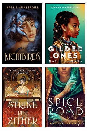
 The cover of the young adult fantasy novel Nightbirds by Kate J. Armstrong reliably hints at the promise and magic of the story that lies within while also seeking to differentiate itself in a saturated market. Not only is the artwork attractively rendered, but it shows the emotion and supernatural abilities of the character Matilde with symbolism attached to the particular bird associated with her in the novel: the goldfinch. This portrayal of Matilde brings the reader's attention to her beauty and lips — the main characters' kisses are the means by which they convey their magic to others. At the same time, her eyes are drawn in a way that evokes the sadness and yearning she feels as she comes of age and fights to establish her own power against years of entrenched oppression. This imagery and the cover as a whole reflect many current trends in young adult fantasy.
Typically, contemporary young adult novel covers in general share certain key characteristics. For example, they tend to be illustrated in rich colors, portray the protagonist and in many cases utilize elaborate typography — Nightbirds hits all of those marks. Another example of a young adult fantasy novel that has these elements is The Gilded Ones (2021) by Namina Forna, which employs large font below a stylized portrait of the protagonist. A couple of additional books that follow this formula are Strike the Zither (2022) by Joan He and Spice Road (2023) by Maiya Ibrahim.
On the cover of Nightbirds, the rich illustrative brushstrokes and style, as well as the mysterious dark blue hues and pops of contrast, create an atmosphere of opulence and secrecy. With a serif font in gold, the cover conveys the echoes of history and tradition that inform the imaginary world of Eudea, as well as the wealth and elitism in the city of Simta, where most of the novel is located. It's also worth noting that the shift away from print books to ebooks, as well as the promotion of books online and on social media, have resulted in practical necessities of design so that cover art can maintain its visual display on small screens. Differences in fonts and size between the title of the book, the author's name and the blurb serve to create visual impact and maintain readability.
Young people face a number of distressing issues today: climate change, global conflict, growing disparity of wealth, and heightened mental and physical isolation from reliance on technology and the pandemic. It's no wonder that young adult fantasy is flourishing and seeks to provide a form of escapism, which continues to be reflected in recent trends of cover art. With Nightbirds, the large typeface of the title juxtaposed with the captivating image of Matilde and birds draws strong attention to the escapist promise of the book. With its bird imagery, the cover creates a visual counter against the destruction of nature and the types of modern development that we encounter in real life every day.
A common adage among chefs is that we eat with our eyes first, which brings attention to the importance of plating food. It's no different with books, and the visual impact of a cover will affect a reader's choice of whether or not to consume what lies within the pages — no matter how much one may try not to judge a book by its cover.
More Beyond the Book Articles
This piece by Jennifer Hon Khalaf was first published as a "beyond the book" article for Nightbirds by Kate J. Armstrong.
Every time BookBrowse reviews a book, we accompany it with a "beyond the book" article. You can read thousands more in our Beyond the Book section.