Simon Garfield, author of Just My Type, discusses the extraordinary history of fonts; which of the more than 100,000 estimated font designs in the world he considers the best, and worst; and explains why you should be cautious about downloading fonts off the internet.
How did you become interested in fonts?
I've been interested in fonts long before I knew any of their names or anything of their history. It began seriously for me when I bought my first album covers as a boy - I clearly remember going to a shop near my home in north-west London, buying David Bowie's Hunky Dory and Electric Warrior by T Rex, and gazing at their sleeves on the bus. That was the beginning of it. A fascination with book jackets soon followed, and then the credits on TV shows, and then computers.
Why are there so many different fonts?
I haven't counted them all, but there are an estimated 100,000 different font designs in the world, most of them available to download on your computer. Of course we don't need them all, but then again we probably don't need all the songs in the world either, or all the paintings. But we will always need to express our emotions in new and modern ways, and we are a creative race, so we need to keep on inventing.
Everyone likes to ask what your favorite font is. I'll go one further: what is your favorite letter? Why?
At the moment (and this tends to change every week), my favorite letter is the lower-case 'i' in the London Underground font. Designed by Edward Johnston almost a century ago, it has a wonderful diamond shape where the dot would normally be, and it brings a smile to my face every time I travel by Tube.
Have you ever attempted to design a font?
While writing the book I thought it was my duty to have a go at designing a typeface myself, and the results were predictably disastrous. Most good type design begins with drawing by hand, but I went straight to Fontographer 4, and I think I abandoned the project at C. It made me realize two things: how hard it is to make even a single letter both original and arresting; and how talented, patient and underappreciated the professionals are.
Serif or Sans?
That's like asking: Chicken or Fish? Rather different things, and their consumption depends on appetite and mood. For my website, serif. In my dreams, mostly sans.
Since you wrote Just My Type are there any other fonts you've encountered that you would like to add to the Worst Fonts in the World?
I think I'm sticking to the original choice - nothing can ever be worse than the London 2012 Olympic font (2012 Headline), surely? What a terrible way to advertise my home city to the world...
What is an interrobang and why was it made? How come I can't find it on my computer?!
The Interrobang is the best way of saying 'What the xxxx?!?!!!!???' without using lots of ! and ?. It combines the exclamation mark and question mark into one simple glyph. It was invented in the sixties, but alas it never really caught on. Some fonts give you the Interrobang as part of the package - look for it in Microsoft Wingdings 2, and also in Calibri and Palatino.
How did you find out about Doves, the "font that drowned"?
I'm not sure where I first heard of it. The story has entered popular mythology, and I wanted to see if it was true. Fortunately, it was much better than the tale I'd heard: this frail man actually spent many years at the beginning of the 20th century stealthily throwing his creation into the Thames at night, terrified of discovery. My favorite part of the story is that the letters are still there at the bottom of Hammersmith Bridge, slowly forming words. There may be an entire novel down there by now. Of course, you can learn more about it in Just My Type.
It's easy to find fonts on the internet for free - why should we NOT download those fonts?
Well, don't let me stop you. But be aware that there may be many reasons why they're there, perhaps because they weren't accepted by the many online font shops - perhaps they're too similar to what's already available, or perhaps the letters 'fall apart' at large sizes or at different weights. If you buy clones you're denying royalties to the make/distributor of the original.
What do you think about the programs that can turn your handwriting into a font?
I'd say try one and see how grateful you'll be for Helvetica, Georgia and the rest. It's fun, a bit stupid, not very sustaining.
Were there any fonts that you wanted to include in Just My Type but could not find the room for?
They're all in there, but I wish I'd written more about Festival Titling, the type designed for the 1951 Festival of Britain. It's a truly colorful, confident beauty. I'm using it on my business cards.
Unless otherwise stated, this interview was conducted at the time the book was first published, and is reproduced with permission of the publisher. This interview may not be reproduced or reprinted without permission in writing from the copyright holder.
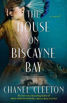
The House on Biscayne Bay
by Chanel Cleeton
As death stalks a gothic mansion in Miami, the lives of two women intertwine as the past and present collide.
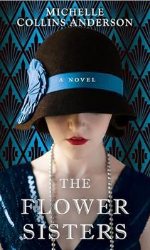
The Flower Sisters
by Michelle Collins Anderson
From the new Fannie Flagg of the Ozarks, a richly-woven story of family, forgiveness, and reinvention.
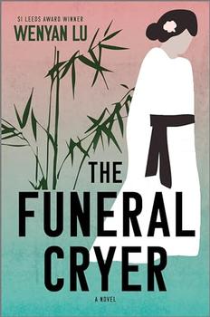
The Funeral Cryer by Wenyan Lu
Debut novelist Wenyan Lu brings us this witty yet profound story about one woman's midlife reawakening in contemporary rural China.
Your guide toexceptional books
BookBrowse seeks out and recommends the best in contemporary fiction and nonfiction—books that not only engage and entertain but also deepen our understanding of ourselves and the world around us.