Apr 02 2024
As you’re racing through a thriller or romance novel, you’re not thinking about the fonts or layout on each page. But a designer has spent hours poring over each element on the page to create the most delightful reading experience. Just ask Leah Carlson-Stanisic, associate director of design at HarperCollins, one of the four biggest publishing houses in the the world. When a manuscript comes across her desk, she considers what font best expresses the content. Historical fiction might warrant a font created in the 1800s. A book about technology might require a more recent sans serif. “It’s 30% experience and 70% intuition,” she says. But over the past three years, HarperCollins’s designers have put their skills toward a new mission: saving paper. In an effort to reduce the carbon footprint of each book, they’re tweaking fonts, layout, and even the ink used. The goal is to pack more into each page, while ensuring that the pages are as readable as ever. And so far, these subtle, imperceptible tweaks have saved 245.6 million pages, equivalent to 5,618 trees.
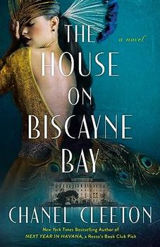
The House on Biscayne Bay
by Chanel Cleeton
As death stalks a gothic mansion in Miami, the lives of two women intertwine as the past and present collide.
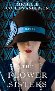
The Flower Sisters
by Michelle Collins Anderson
From the new Fannie Flagg of the Ozarks, a richly-woven story of family, forgiveness, and reinvention.
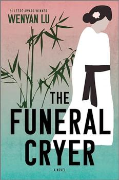
The Funeral Cryer by Wenyan Lu
Debut novelist Wenyan Lu brings us this witty yet profound story about one woman's midlife reawakening in contemporary rural China.
Your guide toexceptional books
BookBrowse seeks out and recommends the best in contemporary fiction and nonfiction—books that not only engage and entertain but also deepen our understanding of ourselves and the world around us.